📑Project Overview
Duration
6 month
My role
Sole UX Designer
Tasks
User research | Usability testing | User interviews | Wireframing | Hi-fi prototyping | Concept ideation
Tools
Notion | Figma | Google Survey | Zoom
This project was completed as part of a professional diploma under the UX Design Institute. Over the course of 6 months, I had the chance to fill in any knowledge gaps while working on this project.
Problem Statement
How might we streamline the hotel booking process to make it faster and more user friendly for our customers?
🚩 Problem
According to SaleCycle, hotel booking sites have an abandonment rate of 84.63%. Further research reveals that one major reason for this is the lengthy time it takes for travel shoppers to complete bookings. According to TripAdvisor's research, 80% of travel purchases take longer than four weeks to complete.
During this period, travelers may abandon the booking process. Although most of this is inevitable, due to shoppers having to do extensive research, I am sure there are things that hotel websites can do to make the experience more enjoyable.
🔄Design Process
🔬User Interviews and surveys
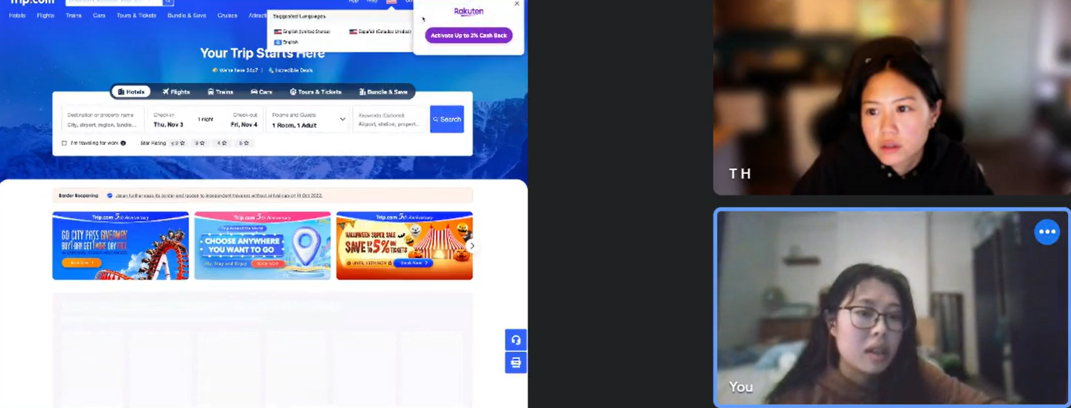
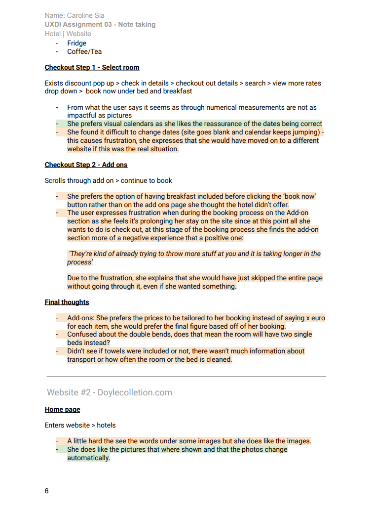
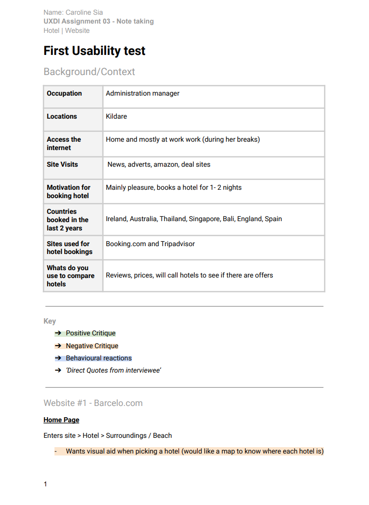
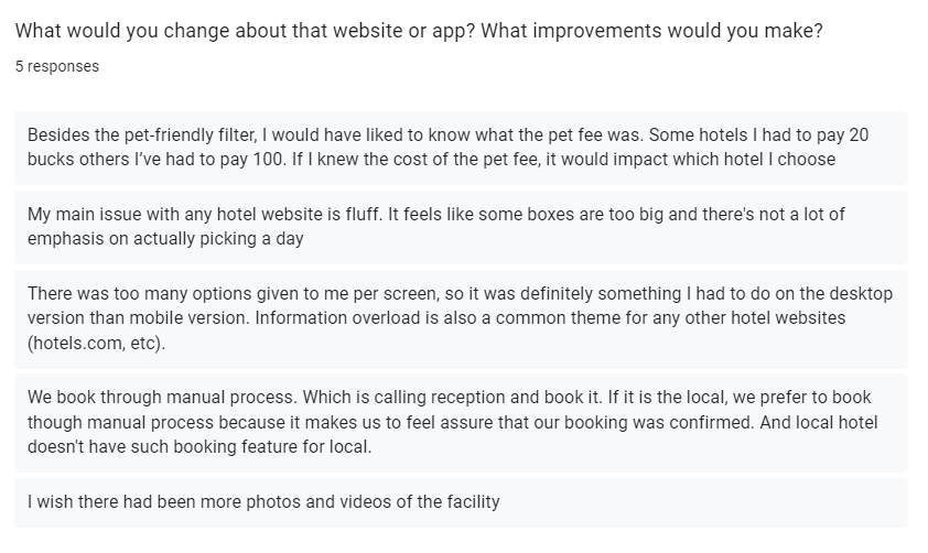
To begin, I conducted interviews with frequent travelers to gather insights into their booking process. The goal of these interviews was to identify any pain points they experienced and to discover common patterns in their experiences and preferences. In addition to the interviews, I had users complete usability tests on two competitor sites to further inform my research.



🗺️Affinity Mapping
Since I was able to gather so many insights, I wanted to do some affinity mapping, again my main object is to find pain points and patterns. To make things easier for me to browse later on me also organized the insights into positive comments and negative ones
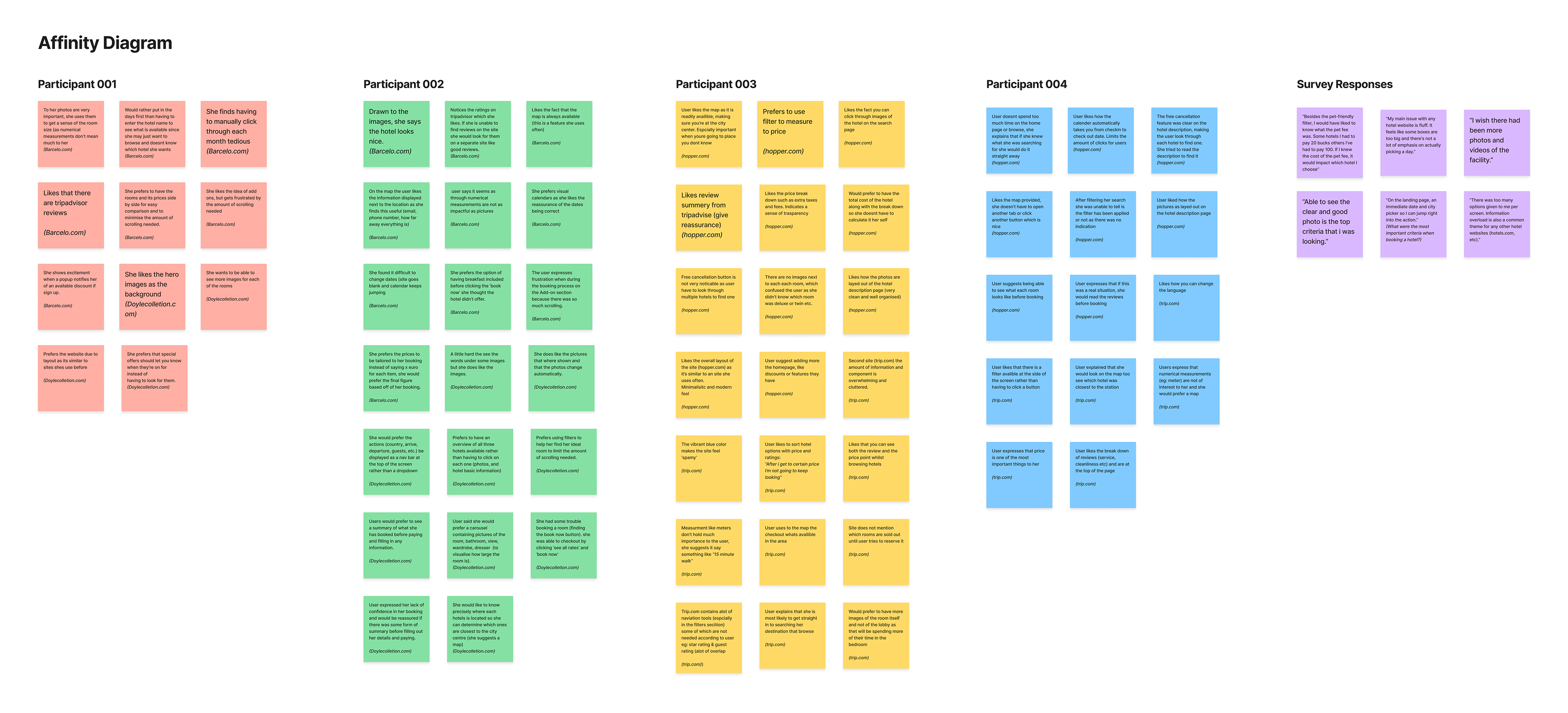
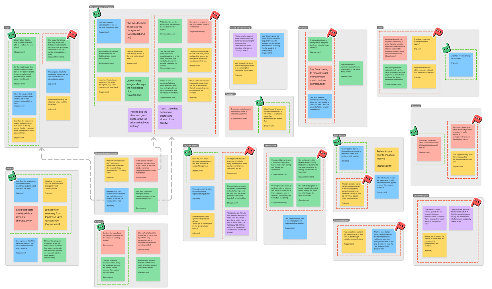
After reviewing the map, I discovered that users expressed a range of concerns and frustrations related to different aspects of the booking process. However, the large number of themes created can be overwhelming and confusing. To simplify the analysis, I created an overview of user feedback for each theme and prioritized them based on the amount of feedback or complaints received and whether the problem would affect the user flow. This approach allows me to identify which themes are causing the most difficulty or frustration for users and should be addressed as top priorities.
After summarizing the themes, I came to the realization that they were not as overwhelming as I initially thought. As a result, I decided to approach each frustration as a smaller problem that can be easily resolved. If this were a real-world scenario, I would prioritize these tasks accordingly.
📍Customer Journey Mapping
To gain a deeper understanding of the user experience, I opted to develop a customer journey map that simulates a typical use case. The objective of this exercise was to cultivate empathy with users by comprehending their goals, behaviors, and situational context. In addition, this methodology enabled me to identify potential areas of frustration and opportunities for improvement in the user flow. By utilizing this approach, I can optimize the user experience and ensure that the end product aligns with user needs and expectations.
I also took this time to consider the pain points I already had and how they can be implemented through the flow. For example, use of imagery and the minimisation of scrolling.
Outcome
I was able to consider pain points and opportunities during every step of the user flow,. I even discovered pain points that I had not previously considered. For instance, users often have multiple tabs open on the same site, displaying different hotels, for the purpose of comparison. This can cause frustration for the users.
📈Flow Chart
To give me a better idea of how the users would go through the site I made a flow chart, I also considered different screen states in order to anticipate how the design would respond to different user actions. This approach helped me create a user-friendly design that met the needs and expectations of the users.
✏️Sketch
I then went ahead and translated the flow chart in to wireframe sketches, I layouts of each screen was based on the usability test done during the initial research, taking in to account, features users liked during interviews and that user prefer a more simplistic design when browsing through hotels rather than cluttered interface.
💻Walkthrough
Home page
Upon arrival at the site, users are promptly prompted to enter their desired destination or hotel, as well as key information such as check-in and checkout dates, and the number of guests. This approach is in line with industry standards and is consistent with competitor websites. Furthermore, based on user interviews, it has been found that users typically have a clear idea of what they are looking for when visiting hotel sites and are less likely to browse. As such, the home page has been designed to be minimalistic and streamlined to facilitate an efficient and effective user experience
Results page
Following feedback from users, an interactive map has been added to the right-hand side of the webpage. Through surveys and user interviews, it has been observed that users find visual aids such as images and maps to be extremely useful. In view of this insight and the significance of maps to users, I decided to allocate half of the page to the interactive map for ease of access.
Furthermore, users have expressed their discontent with cluttered layouts. Therefore, the layout has been designed to be as simple as possible, to prevent users from feeling overwhelmed by the number of components available.
Hotel description page
During user research, I discovered that many people found our website overwhelming due to the sheer volume of content. Users expressed feeling confused about where to begin, and indicated a preference for simplicity in design. In fact, some users mentioned that they preferred booking sites such as Hopper and Airbnb because of their minimalistic approach to design. So based on this insight, I implemented a design that prioritized simplicity and eliminated clutter.
Comparing hotels
Through analyzing the customer journey, I have found that users tend to open multiple tabs of various hotels for the purpose of comparison. To address this issue, I propose the development of a user-friendly feature that enables users to compare hotels without the need to open additional tabs.
Checkout page
Upon checkout, the information collection process is divided into three distinct sections, namely personal information, special requests, and payment details. This division of information reduces cognitive load, enabling users to complete the process with ease, section by section, without feeling overwhelmed.
Additionally, users are provided with an overview of their booking on the right-hand side of the screen. This feature fosters a sense of security by allowing users to review the details of their purchase before finalizing it.
Booking complete
Upon completion of the booking process, users will be directed to a screen where they will receive guidance on the subsequent steps and potential actions they can undertake. For instance, they may be prompted to create an account by inputting a password, which will facilitate future bookings.
🤔Reflection
What I learnt?
During the course I learnt alot about ways to make things easier for users, the paradox of specificity, how to emphasise trust through your designs and more. It also broadened my horizon and provided me a new way of approaching a design problem, typically I would use the design thinking processes since it was the first process I learnt, but now I find that other ways could be more effective, this is something I would like to explore further.
If I had more time...
Looking at the current design trends users are looking for a sites that are more personalised than ever, therefore I would consider implementing a chatbot or live chat feature to provide users with immediate assistance, I would also look in to providing hotel recommendations based on their previous bookings such as pet friendly hotels or hotels with a pool etc. In addition to exploring interactive features to make it more engaging such a emersive scrolling.
