📑Project overview
Duration
1 week
*spent another couple of days working on a website version
Team
Wendi Zhang (UX designer) | Caroline Sia (UX Designer)
Task
Prototyping | Visual Design | Ideation
Tools
Figma | Google survey | Google Slides | Zoom
🚩 Design Problem
"How might we improve the accessibility/education of Web3 projects?"
During the 7-day designation hosted by Avocademy, we were given 3 design problems to choose from, we chose the prompt How might we improve accessibility/education of Web3 projects? Although web 3 has the potential to revolutionize the way we use the internet and share our information, due to the lack of proper and effective education, we believe that it will further alienate casual users from entering the space.
🔬User Research
Our first objective was to conduct user research to identify the challenges users faced when trying to learn web 3 and possible pain points we can tackle.
Themes
Theme 1 | Overwhelming amount of resources
An overwhelming amount of resources cause users confusion, making them feel lost and have no idea where to start.
Theme 2 | Technical jargon
Technical jargon used can create frustration, especially for cause users who may not know a lot about the web 3
Theme 3 | Lack of support / Community
Lack of support can be lonely, discouraging, and affect a learner’s motivation
👩 Persona
Based on the results from our survey we curated 2 personas Sophia and Nathan!
✏ ️Problem Statement
To create problem statements we used the How Might We technique. We didn’t think too much about the statements at first, we focused on writing out as many as we could. We then went through the statements together, pinning the ones we thought best reflected our user’s pain points. In the end, we settled on 3 main problem statements:
In the end, we settled on 3 main problem statements:
How might we…
• Provide a sense of community within our app?
• Promote equity and accessibility?
• Consider users with different learning styles & experience levels?
In the end, we settled on 3 main problem statements:
How might we…
• Provide a sense of community within our app?
• Promote equity and accessibility?
• Consider users with different learning styles & experience levels?
🧭Prioritization Matrix
Due to our tight deadline, we needed to make a quick decision on which ideas to pursue. To make the best decision, we created a prioritization matrix. This matrix helped us sort our ideas based on how feasible they were and how much value we think they would bring to the user. This way, we could choose the best solution that would bring the most value to the users and be achievable within our time frame.
We estimated the value to the user based on our previous research, but in a real scenario, we would have tested the solution with real users to make sure it would really bring value to them, before going ahead with the idea. By doing this, we would have a better understanding of what the users really wanted and needed.
💡Ideation
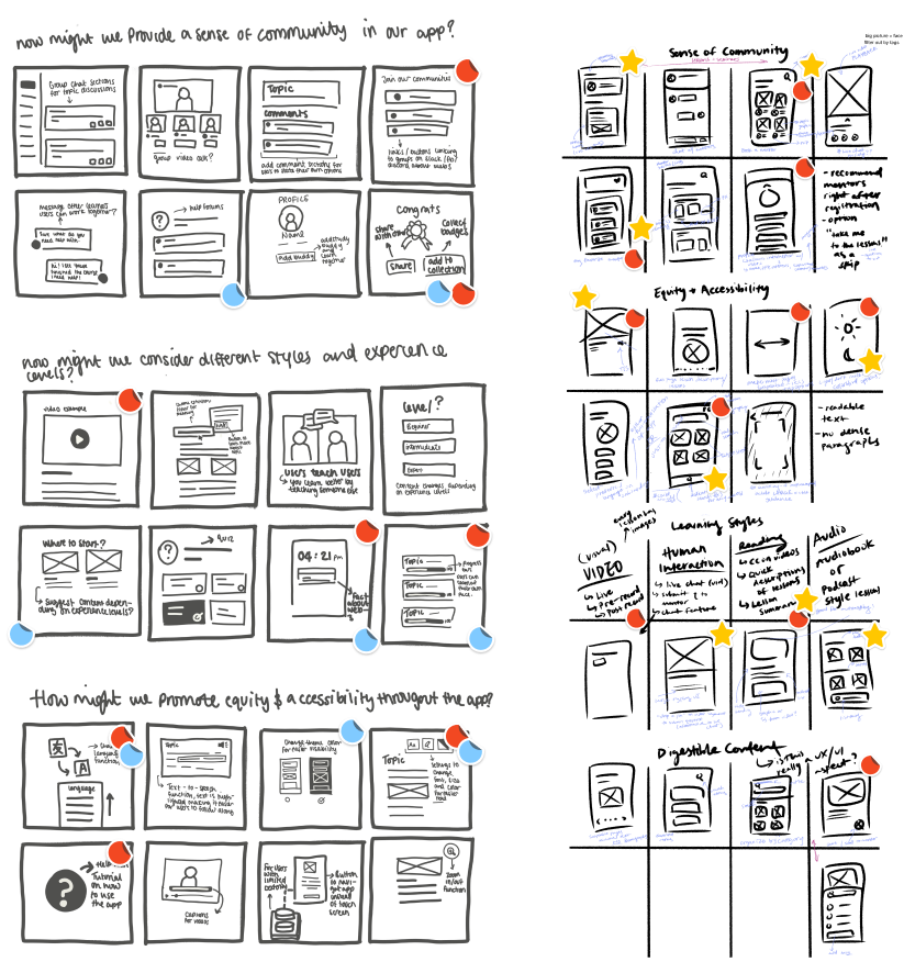
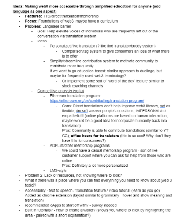
We then moved on to the ideation of potential solutions. The ideation method we decided to use was crazy eights. We did this for each of the problem statements we made previously. We then went through another round of discussion, marking our favorite (and most viable) ideas. We also brain-dumped additional ideas and insights on a shared doc to further organize our thoughts as we got ready for wireframing.
🖼️UI Research
At this point, I had a good understanding of the features that should be incorporated into the app. To gather inspiration and get a clearer picture of what the app would look like, we conducted some basic UI research. We examined how other designers had designed similar features to the ones we wanted to add to the app. This research helped us determine the types of components we wanted to use, the layout of the app, and the overall look and feel.
💻 Prototyping & Iterating
When designing our low-fidelity wireframes, we made sure to tie everything back to our problem statement and user flow to prevent us from getting sidetracked.
Low-fidelity Wireframes
Home Page Iterations
🎉 Solution
Onboarding
For our onboarding flow, we followed the standard mental model of a typical signup process, this provides users with comfortability and familiarity. Users are asked for their experience level and topics of interest so the app can tailor the learning content to their preferences and needs. To promote accessibility through diversity, we also asked about their preferred language.
Live lessons
Most of the people who filled in our survey noted that they were visual, auditory, and or interpersonal learners, with this in mind we thought that the best form of learning would be through video lessons. Blueprint features both live seminars and pre-recorded lessons as well as provides captions for further accessibility. We also added a section where users submit questions during live lectures.
Booking a consultation with mentor
To create a more personalized and human learning experience, we added a ‘book a mentor’ feature. This allows users to meet with more experienced mentors on a one-on-one basis to get answers to their most in-depth, burning questions. The concept was inspired by ‘Cofolios’ and ADP list, two sights where junior designers can meet with UX professionals for mentorship and guidance.
To increase accessibility we added different flags next to each profile name so mentors and mentees alike can speak in a language that is most comfortable for them. With this feature, we hope to motivate users to keep learning and become more involved in the Web3 community.
Help Forum
Often time users can feel alone when learning which can cause demotivation and unwillingness to learn. To address this, we decided to add a help forum where people can submit and answer questions. This forum aims to provide users with a community where everyone is learning together.
When starting, we understand that users may feel intimidated about asking questions, fearing judgment for their lack of knowledge. Although there is nothing to be ashamed of we felt that the best solution to this is to allow users to submit questions anonymously. This way, our forums are more inclusive to users with varying degrees of knowledge and experience.
Desktop
After the designation out of curiosity I conducted a survey asking users the types of devices they use when learning online, 80% of users say they prefer using a desktop rather than a phone. This was due to a “bigger screen” and that using a phone would be difficult to get into a "learning mindset"
Although we initially designed the app for the purpose of convenience, giving users the option to learn anywhere, whenever they would like, at home, or on the go. Based on the insights I designed a desktop version to accommodate users who learn better using a desktop.
*This was not part of the designation, it was done in my own time
💥Impact
Our design solution Blueprint ranked in the top 10% out of 200+ design entries👏
🎒Takeaway
Within the span of a week, it turns out we were able to learn a lot. Here are our 3 main takeaways from the experience:
What we learned
Having a strong MVP is more important than having a million features
Next time...
Gamification in learning
A study from Intuition, a leading global knowledge solutions company found that Gamification Increases learners' Productivity and engagement by 67%, companies such as Duolingo and Kahoot are just 2 examples of gamified learning. If we had more time this is definitely something to incorporate.
Consider flow through the mentor's perspective
Working on the user flow through the perspective of our mentors and their experience with the product, due to a time limit this was not something we were able to consider during the designation as they are also our main target users.zzzf*If you cannot see full prototype screen, simply select 'z' on the keyboard
